

What Is The Difference Between Mobile-Friendly, Mobile-Optimized, Mobile-Responsive, Mobile-Adaptive, and Mobile-First?
We’re living in a mobile-first society. The tipping point where mobile internet usage surpassed that of fixed connections happened earlier than many experts anticipated.
It’s no longer a question of whether mobile matters. Now, it’s about figuring out the right mobile strategy when it comes to design, end-user experience, and most importantly, Google’s stance on mobile in terms of SEO (Search Engine Optimization).
This blog title mentions a few technical terms that describe how websites display content on mobile devices. The nuances between them are imperative to understand. Let’s take a closer look.
What Does Mobile-Optimized Mean?
Mobile-optimized refers to a separate, specifically designed for-mobile website, other than the primary site or desktop-only site. A mobile-optimized website is also known as a few other terms such as Separate URLs, a dedicated mobile site, mobile site, mobile version, m-Dot site, mDot site, and others. While many thought a mobile-optimized website was the way to go, it is not near as good as having a mobile-responsive site which we will get into shortly. Facebook is an example of a company that still has a mobile-optimized website as of 2019. While you can still access the mobile version of the site on a desktop, you can easily see it was designed for mobile.
It was with the launch of Pages in 2007 that businesses first jumped into the Facebook social media pool with both feet. Facebook Pages provided businesses an opportunity to get their brand, message, products, and services in front of the public in a very relevant and very free way. It only took a few years for people to realize that this free method of marketing was not reaching nearly the number of people that they thought it was. Since the initial decline in 2012, Facebook has continued with this trend of reduced organic reach for content from Pages.
What Is A Mobile-Responsive Website?
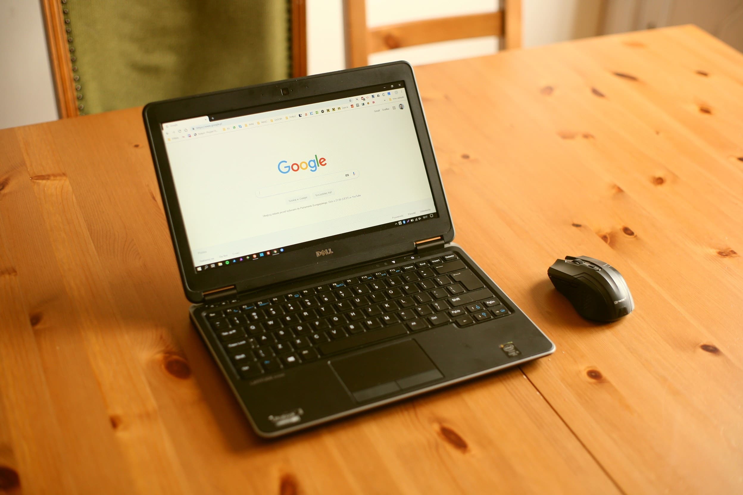
Mobile-responsive is another way to say responsive design or responsive web design. Responsive web design refers to websites that automatically adjust for the user regardless of the device. The site’s framework allows elements to automatically and seamlessly rearrange for smartphone, tablet, and PC users. For example, an iPhone screen and an iPad screen are two different sizes, but when viewing a mobile-responsive website, the content will automatically adjust to fit the device interface without having to send a different set of HTML code for each screen size. Here is an example of a mobile responsive website.
Google will even tell you that they recommend a responsive design because it saves them time and resources, among other things. It is well known that when Google says something, it is time to embrace and adapt. One important thing to note: a website built with a responsive design still should be further optimized for mobile. This means putting yourself in the visitor’s shoes and making tweaks and adjustments that will make the visitor’s experience that much more enjoyable on a mobile device. These adjustments could include things such as an easier-to-navigate menu, a small back to top button, a shrinking or disappearing header, and many more.

What is Mobile-Adaptive?
Mobile-adaptive web design is also known as adaptive web design or as Google calls it dynamic serving. It has similarities to a mobile-responsive site such as it only uses a single URL for its visitors and they both look good across multiple screen sizes. Both are excellent options and better than a mobile-optimized website.
Even though an adaptive website and mobile-responsive website are similar, they have distinct differences as well. An adaptive site does not auto-adjust relative to the screen size. Instead, a web developer has to create several different HTML layouts (usually six or more of them) based on screen size. When a visitor enters the URL on their device, the site delivers one of the layouts closest to the screen size of the device.
The end-user may not usually notice a difference between the two designs. However, on an adaptive website, if there is an issue with the Vary HTTP header, they could incorrectly be served the HTML code for the desktop site on a mobile device. Granted if something went wrong with the HTML code on a mobile-responsive website it could have issues as well.
One example of adaptive web design is none other than Amazon. You will notice if you go to the website on your computer and then also visit the site on your smartphone that things will look a little different. Some things are in similar places, while others are harder to find. For example, see how fast and easy it is to get to the footer on your desktop and then try to scroll down to the footer on mobile. Spoiler alert: in our test, we had to scroll about 15 seconds on our iPhones.
What About Mobile-Friendly?
What does mobile-friendly mean? This term has somewhat been thrown around to say several different things; however, we will stick to what Google has consistently been referring to mobile-friendly as. Mobile-friendly is a gauge that measures how easy it is for a visitor to use a website on their mobile device. That website could be one of three different configurations (two of them we have already discussed).
The three different types of mobile-friendly website designs or configurations that Google tells us about are:
- Responsive Web Design (aka mobile-responsive)
- Dynamic Serving (aka mobile-adaptive)
- Separate URLs (aka mobile-optimized).
Google goes on to say, as mentioned earlier, that they recommend going with a responsive design.
With that said, Google has tools in place such as the Mobile-Friendly Test which shows you what needs improving on your website. Once you make the suggested changes, users will be able to have a better experience while accessing your site on their mobile device. This adaptation can, in turn, positively affect your SEO.
So, What Does Mobile-First Refer To?
What does mobile-first mean? Mobile-first is where a website is built based upon how a visitor will experience the site from a mobile device. A mobile-first website falls into one of the three configurations mentioned above: mobile-responsive, mobile-adaptive, or mobile-optimized.
How does mobile-first differ from mobile-friendly? The two are very similar with one main difference. Mobile-first describes the intention of the site: the designer built the site with the aim or purpose of providing a good experience for whoever accesses the site on a mobile device. Mobile-friendly however, is an adjective that can only be used to describe a website that, in reality, does provide a good experience for those that access the site on a mobile device.
If the difference still isn’t clear, here is a metaphor that may help. Let’s replace websites with cake. The terms we will use are tasty-first cake and tasty-friendly cake. A tasty-first cake means you intended for the cake to be tasty when you made it. A tasty-friendly cake means the cake actually tastes good! Again, one is the intention, and the other is the actual result. You or your web designer most likely had good intentions when building the mobile-first website. However, the end result may be that the site needs more work and is not yet mobile-friendly. However, you know what? As long as you fix it, it’s okay! No one is perfect, and things with Google are always changing and evolving, and all any of us can do is adjust or get left behind.
Mobile-First Indexing
Speaking of mobile-first, back on November 4, 2016, Google announced it started testing mobile-first indexing. Google suggested if you have a mobile version of your site on a separate URL that you should begin to optimize it for SEO. The timing of this announcement may have been because in the month prior, for the first time in internet history, mobile had surpassed desktop in worldwide internet usage!
What is mobile-first indexing? It is where a search engine crawls your mobile-first website (instead of the desktop only version: see below) to collect and organize data. This way, the search engine knows how best to serve up relevant results when someone searches. (Keep in mind that mobile-first indexing is not referring to how the content will be ranked but rather how the content is gathered. Ranking involves several factors, including the mobile-friendly evaluation, page speed, as well as many other things.)
What Is Desktop-First Web Design?
There is also another type of design that is not mobile-friendly. This type of design is called desktop-first web design (also known as desktop-only web design). It may be obvious to you, but just in case we will clarify what desktop-first means. It’s a website that was originally intended to be viewed on a desktop computer. The good news is, in most cases, your desktop-first site can still be seen on mobile even if Google doesn’t classify it as mobile-friendly.
We say “in most cases” because, believe it or not, desktop-first websites still exist. Some of these websites continue to run flash player or other software that isn’t compatible with current mobile devices. If however, your smartphone or tablet can fully load the desktop-first site, it will look the same as it does on a PC. This rendering does not provide a good user experience.
When viewing a desktop-first website on mobile, elements tend to be squished together, which makes it hard to read text or tap on buttons or links. For example, let’s say a website viewed from a desktop has a series of three elements in a row (e.g., three images or three text blocks). On a desktop-first website, those three elements will still be side by side when accessed via mobile.
Users will have to pinch and zoom in to read the content. While some people may not mind taking this extra step, many will back out of the site and go to a competitor’s website designed for mobile. Fortunately, the number of these outdated sites has been going down as time goes on. However, there is still a multitude of them in use as of 2019. The only time you should ever see a new desktop-first website built is if someone is using a mobile-optimized solution. Again, as Google has gone on the record to mention multiple times, mobile-responsive is their recommendation.
Challenges of Going Mobile-First
Mobile-friendly has become a popular term when discussing mobile browsing experiences. Companies must take note that there is a lot more involved in being mobile-friendly than merely allowing users to access your website via mobile.
There is good news. Whether you are doing it yourself or paying a professional, once you have designed and optimized your website to be mobile-friendly, future updates will be easier. Moving forward, you will have a mobile-first understanding of how Google wants things done regarding mobile. Furthermore, if you add your mobile-friendly website into your Google Search Console, you will get notifications if something on your site isn’t mobile-friendly. You can then fix it quickly.
The bad news: optimizing for mobile has its challenges. For starters, mobile-responsive, mobile-adaptive, and mobile-optimized websites can be costly and time-consuming to develop and maintain. Unless you’re having a professional do it for you, you’re going to need to build a mobile-first website yourself from the ground up.
There’s also the added challenge of website design from a mobile-first perspective. Content looks different on a small screen versus a large desktop screen (e.g., small screens are usually viewed vertically while large screens display horizontally). An image that might look great on your desktop might appear too large on a smartphone. Elements that are too close together will be harder to read or click. If you’re going for a particular look, you may have to compromise on certain elements.
Is It Essential to Build For Mobile?
We’ve known for years that providing a better mobile experience is essential. Even though Google favors mobile-friendly sites when searching from a mobile device, there are still many business owners that have not made it a priority. Google recently announced that starting July 1, 2019, mobile-first indexing is now enabled by default for new websites. They will continue to roll out to older sites as Google deems they are ready.
If you’ve been putting off optimizing your website for mobile audiences, you could be doing more harm than good. Without a mobile-friendly website, you could risk slipping in the search rankings or increasing your bounce rate, neither of which bodes well for your profits.
Recent Posts


Connect with Us
Send Us A Message
"*" indicates required fields
Have a Topic You Want Us To Talk About?
LATEST BLOGS
Stay up to date with the latest marketing tips, trends and news

Why Good Content Matters for Your Business
Good content is more than just words on a page. It’s a key element in your digital marketing strategy that can help your business grow and succeed. High-quality content attracts visitors to your website, keeps them engaged, and encourages them to take action. Whether you run a small local busin...

The Importance of Blogging for Your Business
Blogging is a powerful tool any business can use to enhance its online presence and connect with customers. By publishing regular blog posts, you can provide valuable information, showcase your expertise, and address common customer questions. Blogging also helps you stay relevant and visible in ...

Simple Tips for Better PPC Ads
Creating successful Pay-Per-Click (PPC) ads can make a huge difference in attracting potential customers to your business. With PPC advertising, you pay each time someone clicks on your ad, so it’s important to make sure every click counts. Well-crafted PPC ads can help you reach the right ...

Easy Guide to Understanding PPC Advertising
PPC advertising, or Pay-Per-Click advertising, is a popular method used by businesses to drive traffic to their websites. Unlike traditional advertising methods where you pay upfront regardless of results, PPC allows you to pay only when someone clicks on your ad. This makes it a cost-effective w...

Best Strategies for Social Media Marketing
Social media marketing is a powerful way to connect with your audience, build brand awareness, and drive traffic to your website. It offers businesses the chance to reach a large and diverse audience with targeted messages that resonate. However, achieving success on social media requires more th...

How to Make Your Website More User-Friendly
Creating a user-friendly website is crucial for keeping visitors engaged and encouraging them to explore more of your content. A website that is easy to navigate and quick to load improves the overall user experience, making it more likely that visitors will return. Making your site accessible an...

Understanding Google Analytics for Beginners
Google Analytics is a powerful tool that helps you understand how people interact with your website. With the right setup and a basic understanding, you can track important metrics and make data-driven decisions to improve your site’s performance. For beginners, grasping the fundamental con...

Easy Steps to Create Engaging Content
Creating engaging content is essential for capturing the attention of your audience and keeping them interested in your message. When we produce content that resonates with people, it helps build trust, loyalty, and even drives more traffic to our website. The goal is to create something that you...

How Local SEO Can Drive More Customers
Local SEO is a powerful tool for businesses looking to attract more customers. Many people search for local services and products online, making it essential to have a strong local online presence. By focusing on local SEO, you can ensure that your business appears in relevant searches, leading t...

Understanding Social Media Algorithms
Social media algorithms play a huge role in deciding what content we see on platforms like Facebook, Instagram, and Twitter. These algorithms are like secret recipes that determine which posts appear in our feeds. By understanding how these algorithms work, we can create content that reaches more...
